Connecting Venmo users to their favorite charities
Role
UX Designer
Team
4 people
Timeline
2 weeks
Project background
Fintech is one of the fastest growing markets. Venmo wanted to to give its user base the ability to donate unused funds.
This is a concept case study showcasing execution of feature integration at scale within a high-use, established app ecosystem.
My Role
I served as one of four user experience designers. My specific roles included initial generative research, user interviews, survey development, and prototyping the cash out work flow and user testing that flow.
I value tested integration and charity concepts with target users and conducted qualitative research.
I created artifacts to evangelize ideas, drive decisions, and gain alignment.
I defined the core architecture of integration and worked closely with the team to optimize the workflows, navigation system and core interactions.
I built prototypes in order to pressure test concepts and socialize our ideas to the broader team.
I conducted user tests, presented findings and recommended refinements to the experience.
Defining the problem
Venmo wanted to explore new ways for users to send money via the Venmo app to causes that they care about, such as nonprofits or Kickstart campaigns.
First, would users be open to using the Venmo app as an avenue for donation? Second, if so, what is the optimal integration approach?
Diverging on opportunities
Based on initial value testing of concept with target users, we were able to understand their mental model, needs, possible pain points and overall approach to Venmo and donation.
Understanding the market
We knew that Venmo was an ideal platform for donating money to charities. The question became, how can we create a go-to charity donation experience while also keeping it a lightweight, and non-obtrusive integration?
We first started to understand the current product landscape and divided competitive offerings into a four quadrant matrix of transactional, donation, payment, and sharing based app models.
Converging on goals
Don’t disrupt workflows
Many of our interviewees expressed concern that adding new pathways could disrupt current payment requests and cash out workflow, critical to Venmo’s ease of use.
Easy to use
Ease of use and memorability became a critical design theme, as Venmo's work flows were became muscle memory after as little as one attempt.
Reputable
The user base most interested in a charity integration experience cared greatly about legitimacy; therefore, reputable content and user confidence became a major focus
The solution
Venmo Charity is a collaboration between Venmo and Charity Navigator that allows users to use Venmo funds to donate to charities who are sponsored within the charity Navigator API integration.
Will I be able to search of charities?
Users can search for charities using charity navigator's database and API for an integrated search experience.
Will I be able to trust the service?
Using Charity Navigator content, users can learn about the charity and view other donors who make their donation activity public.
Will it be easy to donate?
Users can quickly swipe through favorited charities and donate in the cash out flow.
How We Got There
Even with a short two-week time frame, we felt it was imperative to learn about Venmo's history and to conduct fast market research on its consumers.
New to both Fintech and to the charitable donation space, the team time-boxed collective learning about both industries, generative market research, documenting assumptions, unknowns, and questions for our users.
Mapping the user journey
Feature analysis
The current market landscape was full of apps dedicated to charitable giving. I categorized potential competitive experiences as social based, sharing based, micro-donation based, crowd sourcing based, or strictly payment and transaction based.
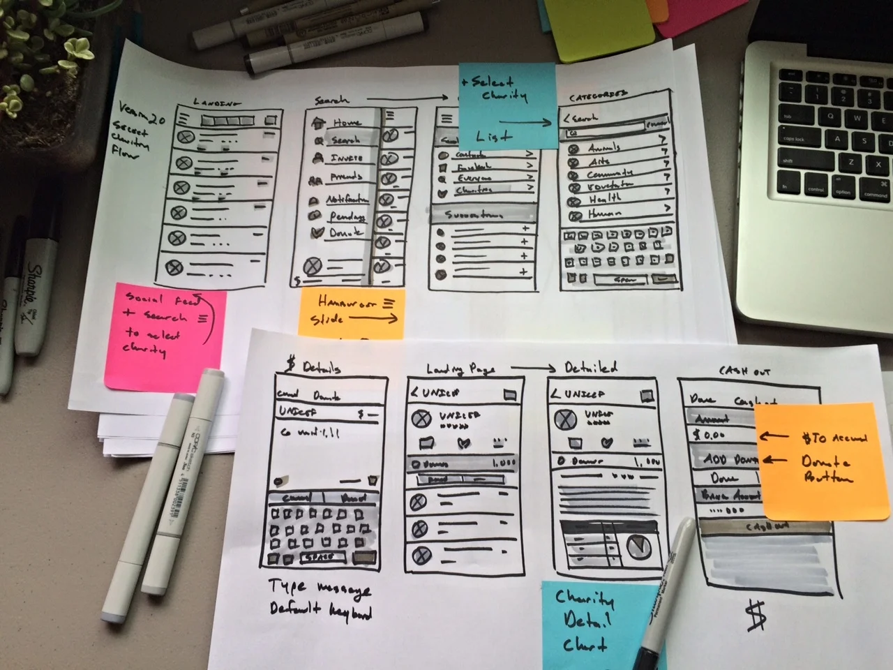
Sketching to prototyping in Axure
The biggest challenged I faced was discovering the lightest weight integration possible with Venmo's current architecture, that didn't disrupt the current payment or cash out flow.
In order to quickly realize all possibilities, we pressure tested our research and interaction architecture against rapid paper prototypes.
Bring it all together
Although the integration was a seemingly simple feature, implementing it within the constraints of the Venmo ecosystem and Charity Navigator API turned out to create unforeseen challenges.
Our final solution was a bi-product of user needs, technology trade-offs and design compromises that created the optimal MVP.
Wins
Optimized button placement
For the cash out flow, our number one priority was not to disrupt the current sequence. We wanted to optimize click through success by introducing minimal click pathways and completion of the donation task.
We conducted A/B testing of various layouts. Overall, our primary goal was to make the donation feature add-on as frictionless as possible, but still prominent within the cash out flow.
Didn’t disrupt the cash out flow
As a team, we decided to take the safe route. Many of our interviewees said that they would definitely use a feature like this, but they didn't want it to disrupt their current flow for transactional requests.
Therefore, we integrated the donation feature into the cash out flow and give users the ability to donate on their own initiative.
Users were completely against any integration during the request for money or payment flow. The simplicity of that flow is critical.


